Toronto Public Library for Kids
Visual Identity
Design System
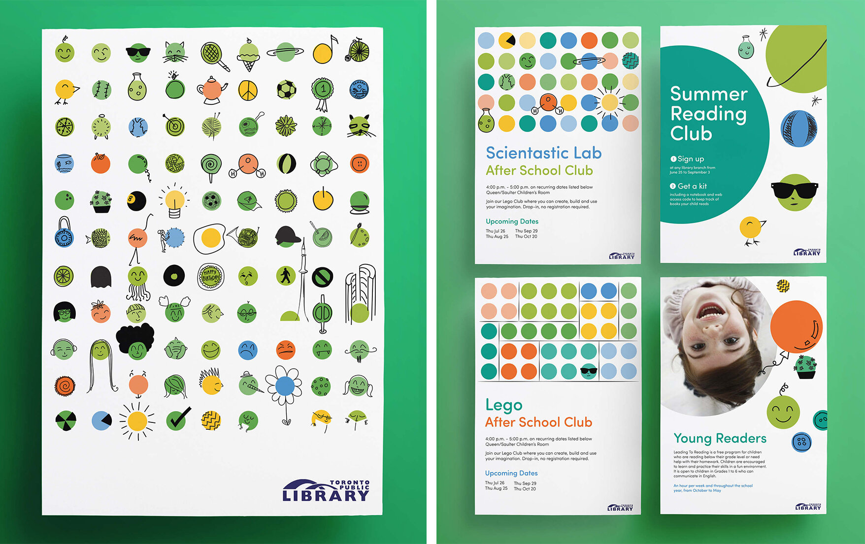
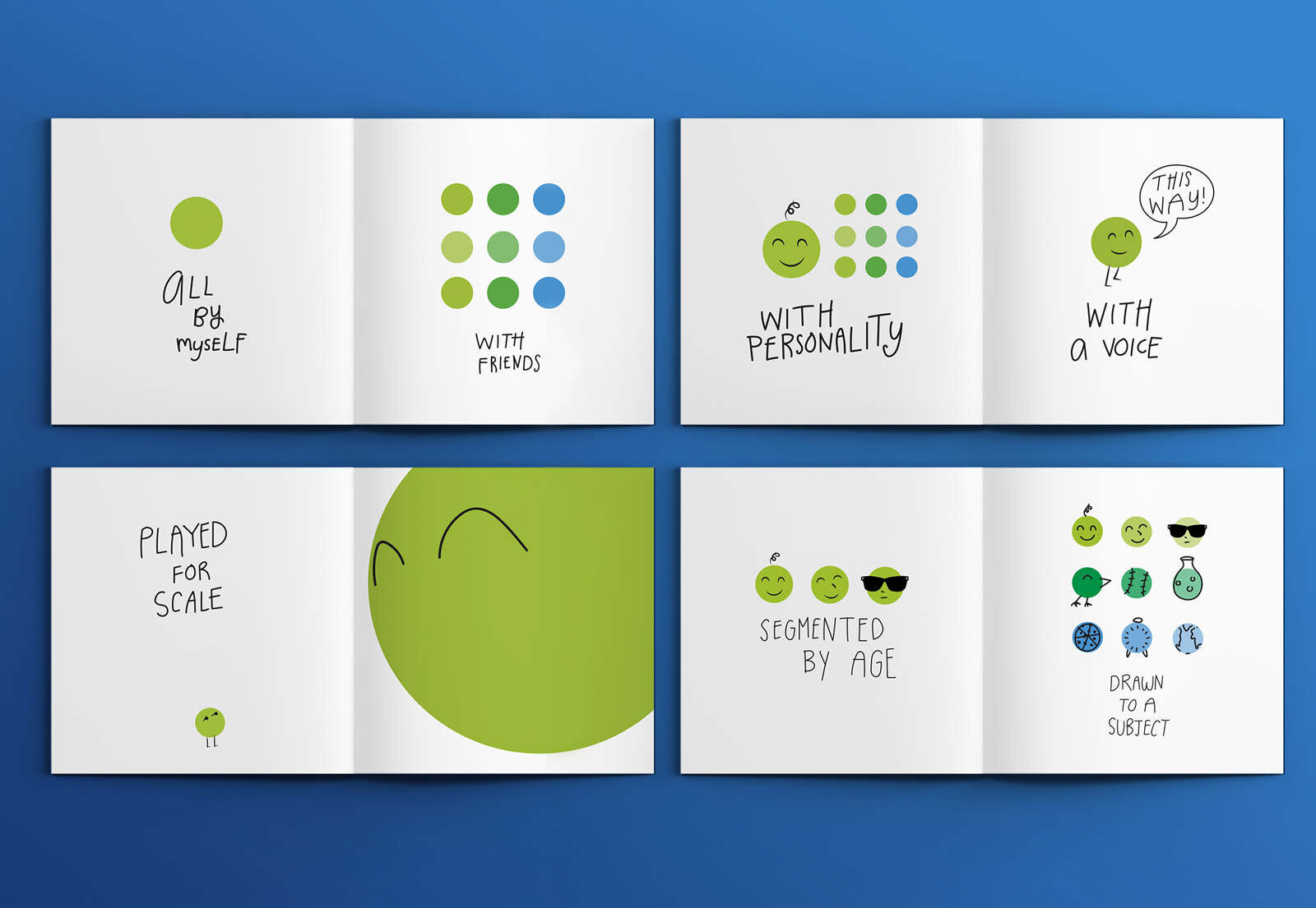
Illustration
Applied Arts Design Awards 2017 winner
Red Dot Communication Design Award winner 2017
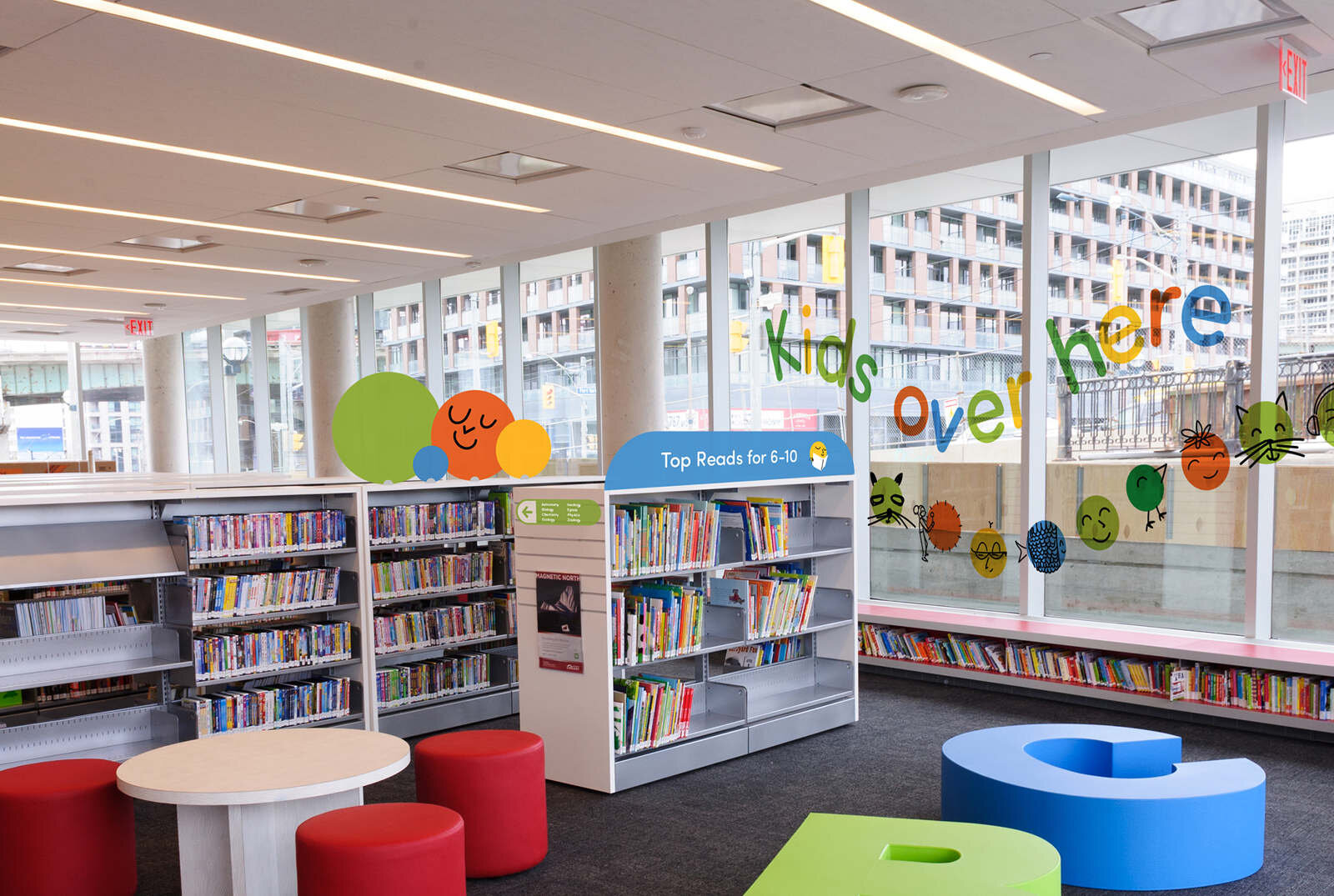
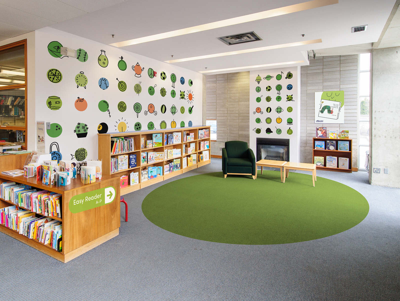
The Toronto Public Library is a beloved institution, and its first dedicated children’s brand needed to establish a framework that could flex seamlessly across spaces, print, and digital touchpoints. The result was a bold, playful “license to go” identity, one that captures the spirit of exploration and adapts to the library’s ever-evolving needs.
The refresh aimed to be modern and versatile, reflecting not only the breadth of programming under the children’s banner but also the diverse environments it needed to live in.
At the heart of the system is the green GO dot—a simple, intuitive symbol that acts as a literal green light for children to learn, explore, and create. This adaptable mark became the foundation for everything from graphic personality and wayfinding to customer service, providing clarity, cohesion, and a sense of possibility across the brand.