Toronto Public Library Kids
Applied Arts Design Awards 2017 winner
Red Dot Communication Design Award winner 2017
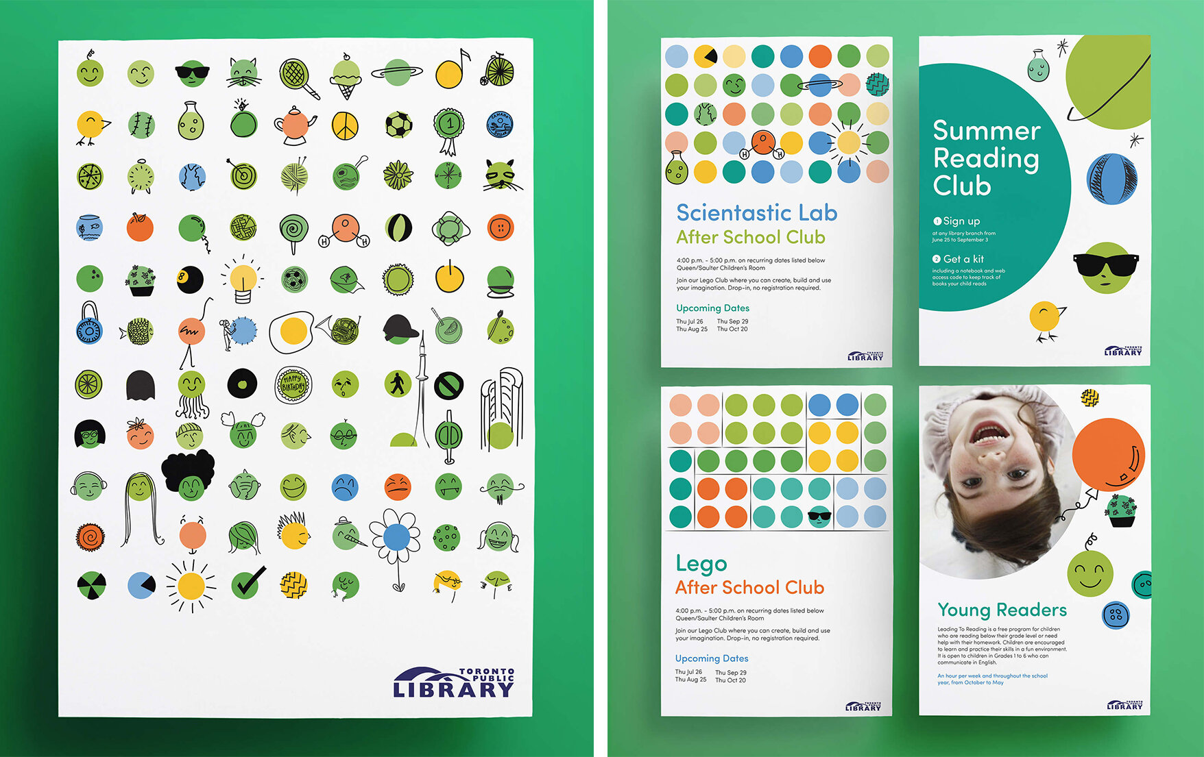
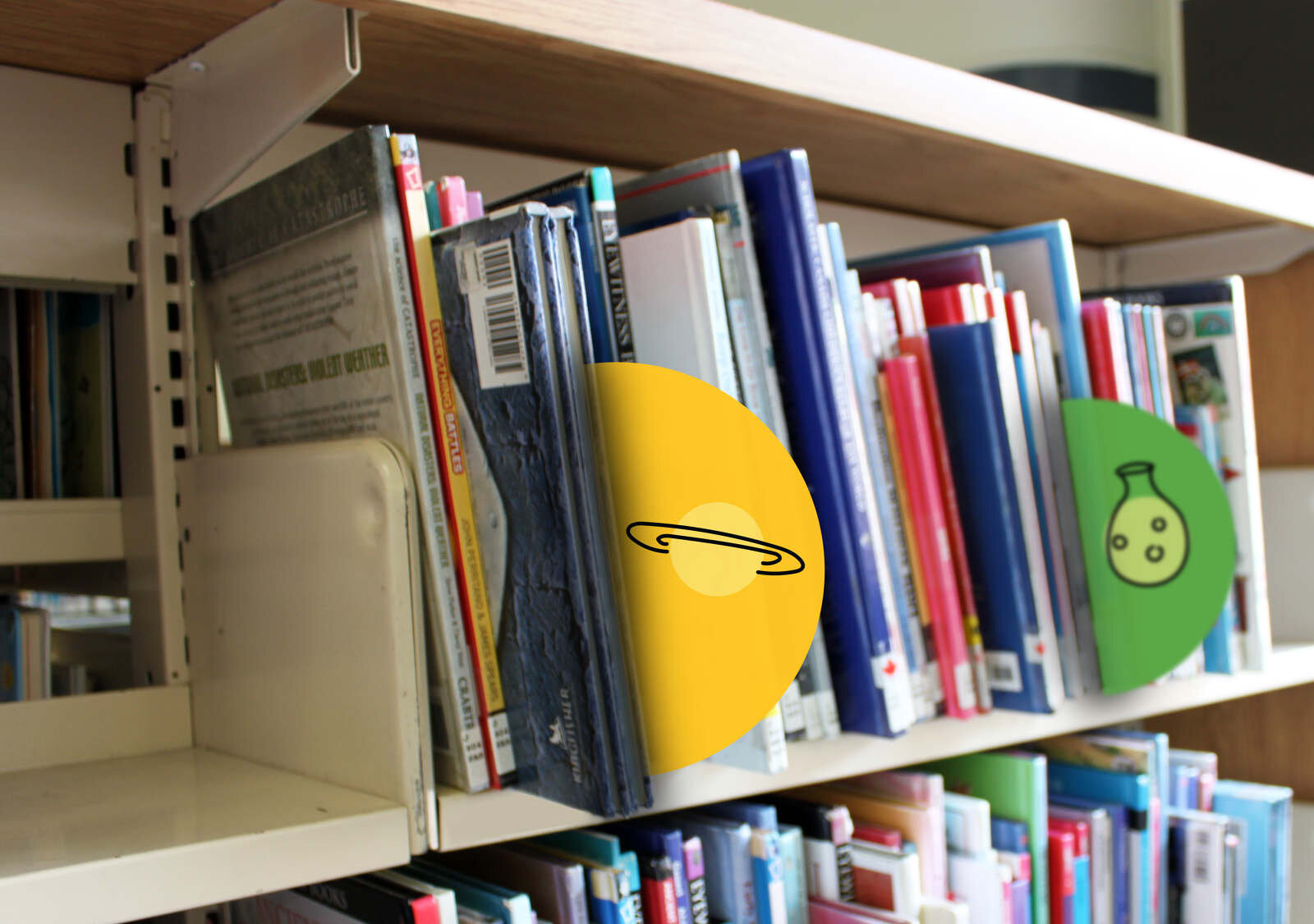
The Toronto Public Library is a big, beloved institution, and its first children’s expression needed to build a framework for spaces, print and digital. A bold, fun license to ‘go’ brand was created that transforms to the ever-adapting needs of the library. The expression is a visual reflection of this license to go, to explore, to be.
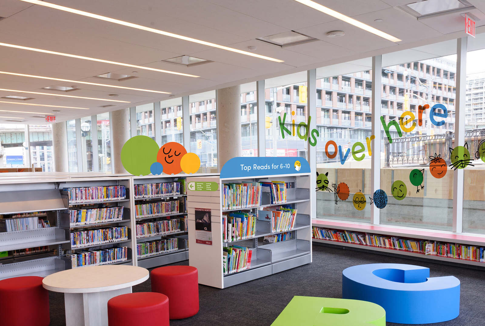
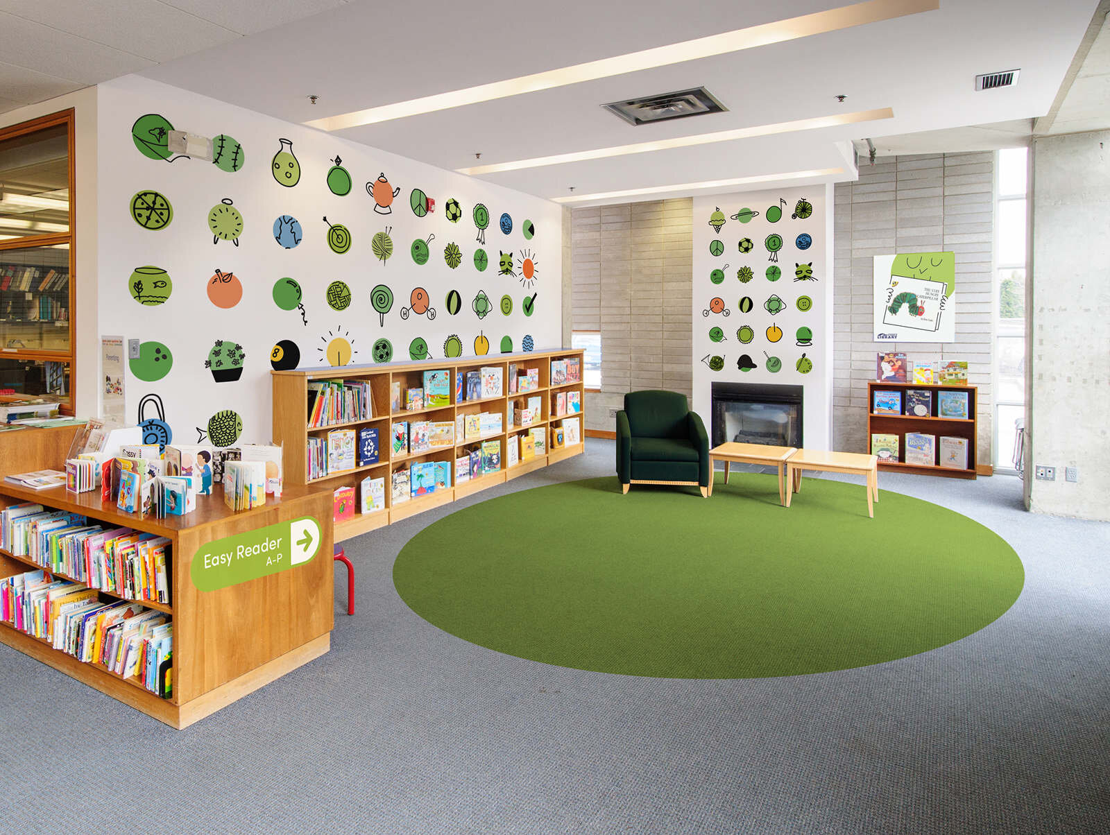
The brand needed a modern refresh, one that took into account not just the breadth of programming offered under the children’s banner, but that could work across a diverse array of spaces, both physical and digital.
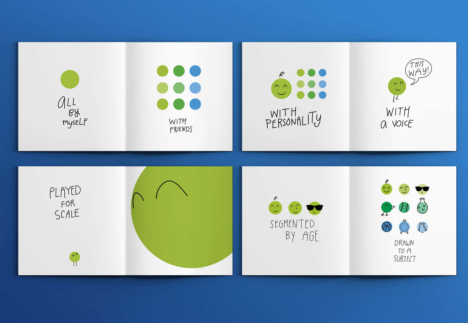
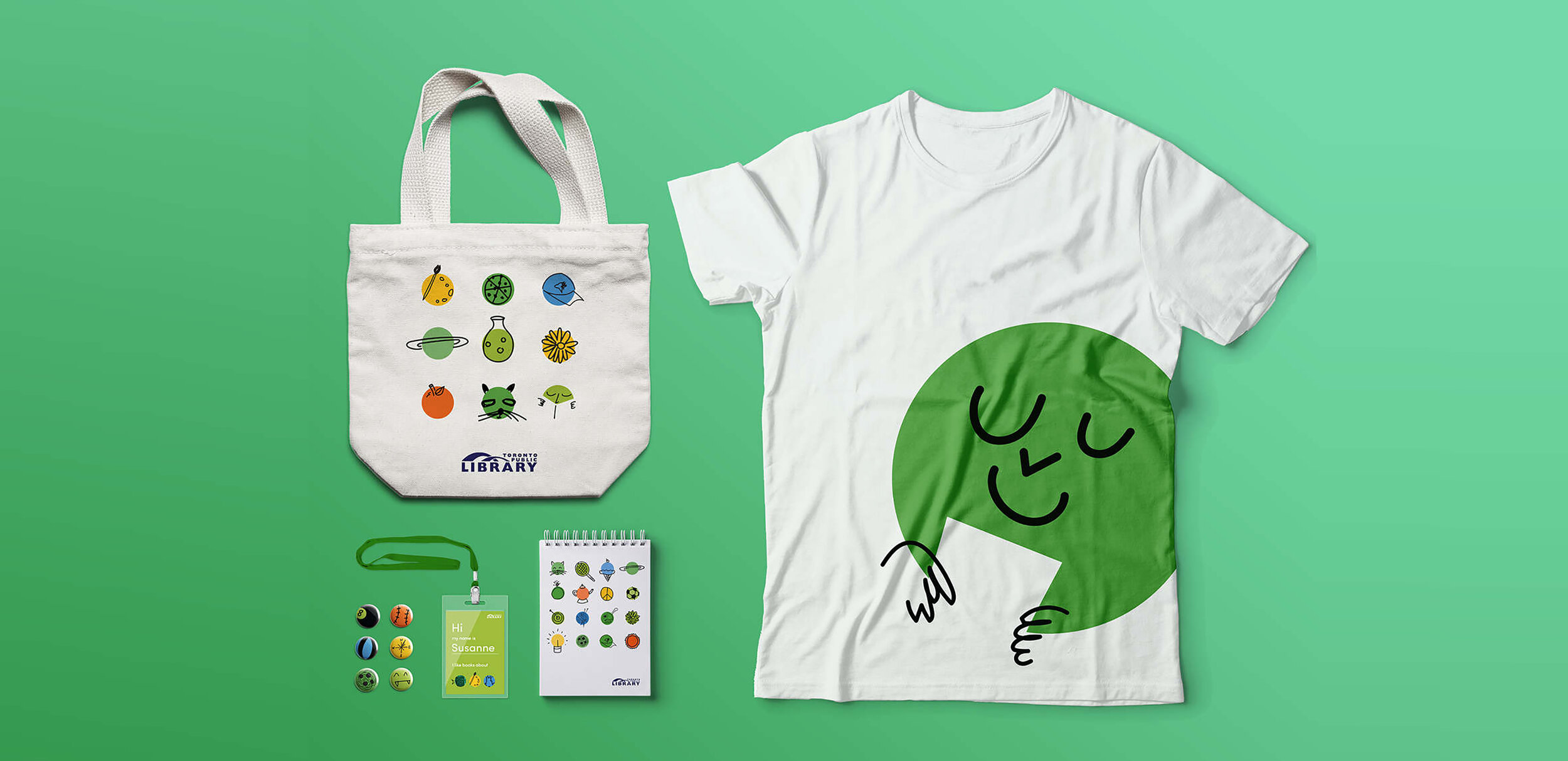
The core of the solution was the green GO dot. It’s a literal green light for children: an easily understood, compelling message to learn, explore and create. The simple application of the GO dot allowed to be adapted across the library’s varied needs, from strategy and graphic design personality to wayfinding and customer service.