
York University School of Continuing Studies
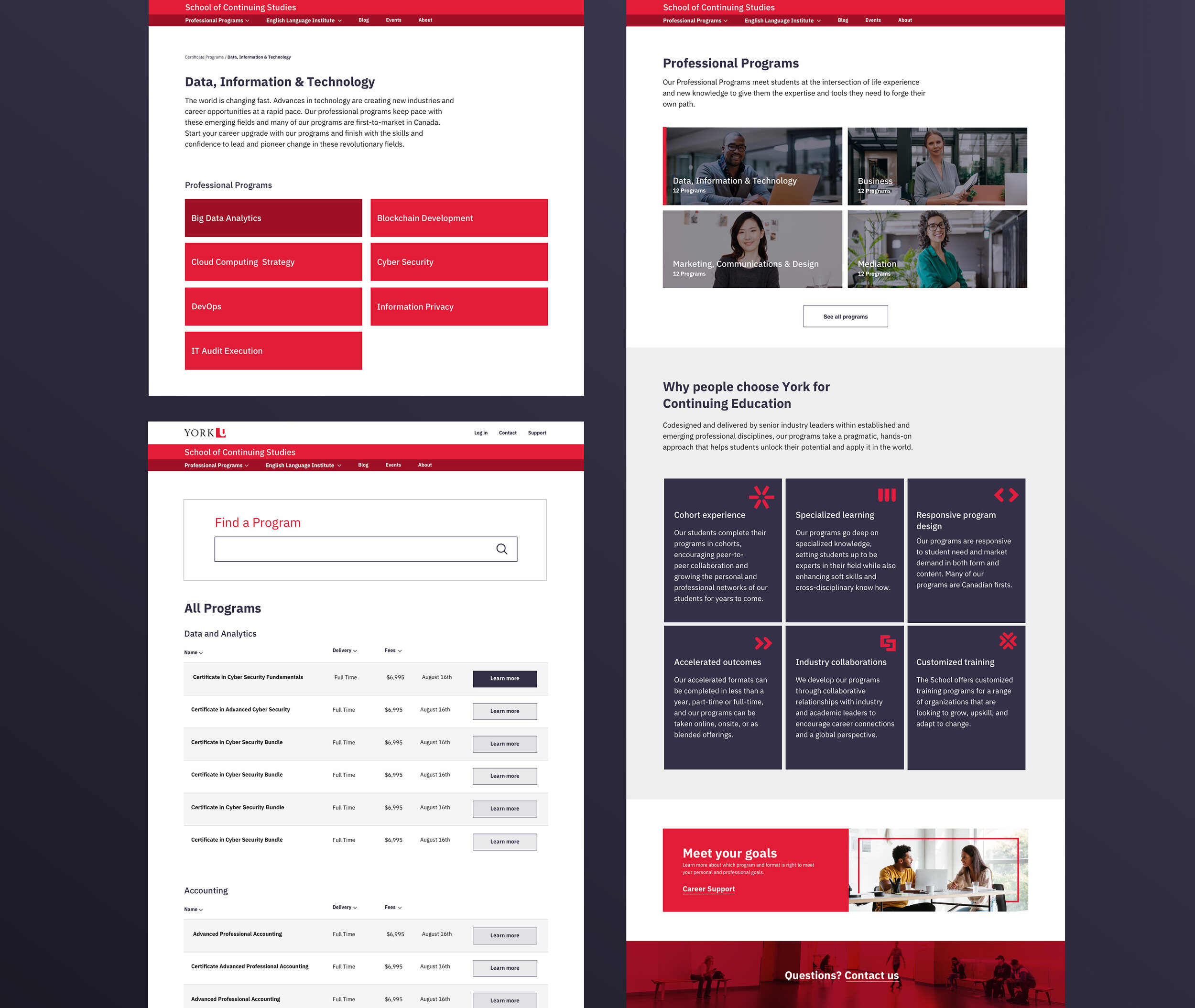
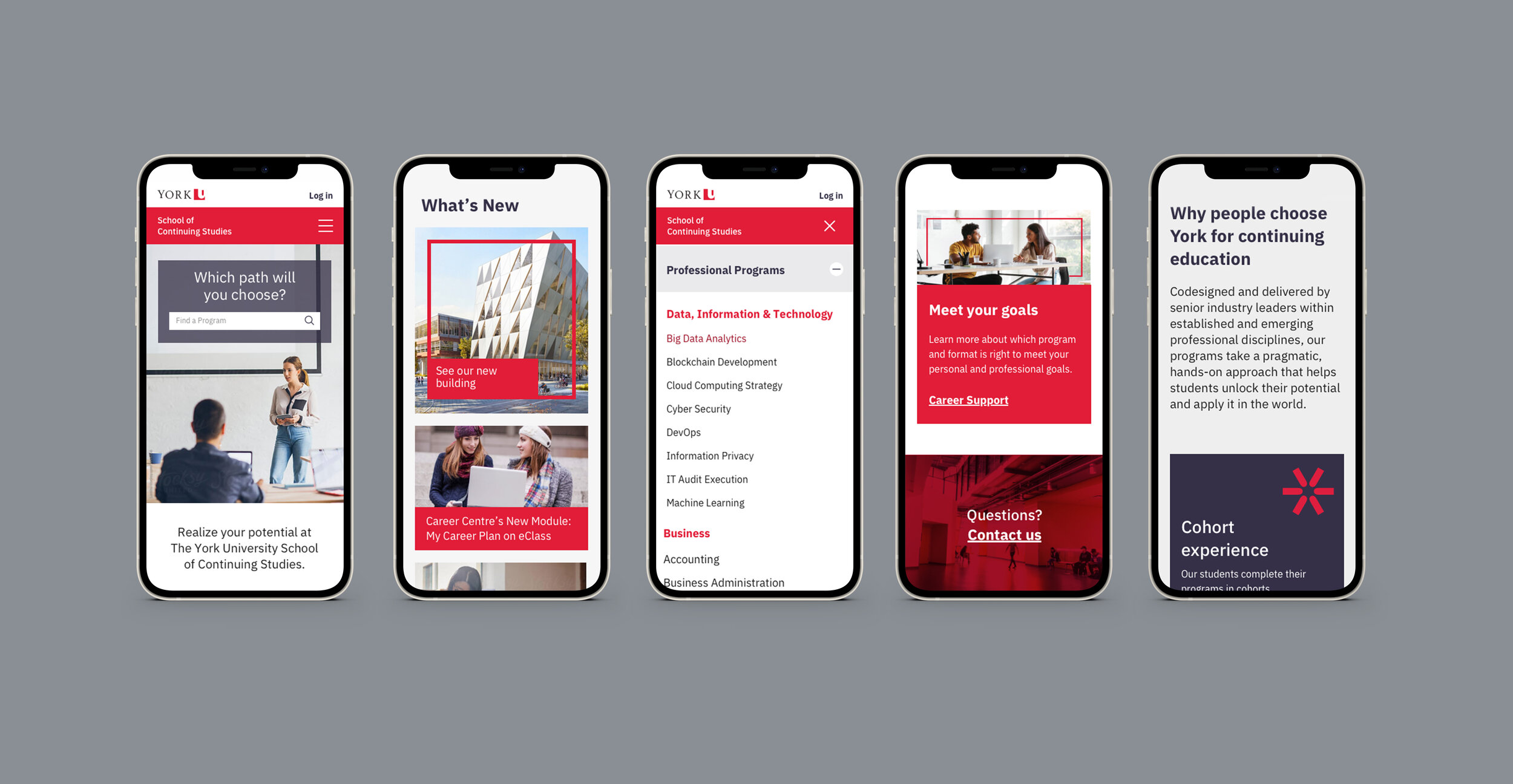
Building on a new brand story and within the constraints of the larger York University brand, a new visual language was created for the School of Continuing Studies. This included the introduction of a rich aubergine color to counterbalance the youthful red of the York brand. An entirely new photo library was also developed, featuring highly diverse, confident, and striking individuals who conveyed a strong sense of purpose.
Balancing design and technical priorities from the University rebrand, stakeholder consultations were conducted across the school and York University to understand a wide range of users and scenarios. The digital presence for the School of Continuing Studies was fully reimagined with a design system that placed program offerings at the center of the user experience. Key features included a robust program search tool, improved content management through flexible content modules, enhanced program navigation, and marketing landing pages optimized for conversions.